A Creature in Motion
Designing the visual identity for Moschops was a visceral experience. This pedal doesn’t just modulate—it growls, pulses, and breathes with intensity. I knew from the start that the graphic design needed to echo that raw, living energy. It couldn’t be passive or ornamental. It had to move, even while standing still.
The inspiration came quickly. Moschops already carried a prehistoric weight in its name—part creature, part circuit pun. I leaned into that. What would this creature look like if it were real? How could its shape and posture convey the rhythm, chop, and swell of the tremolo inside?

The Creature Concept
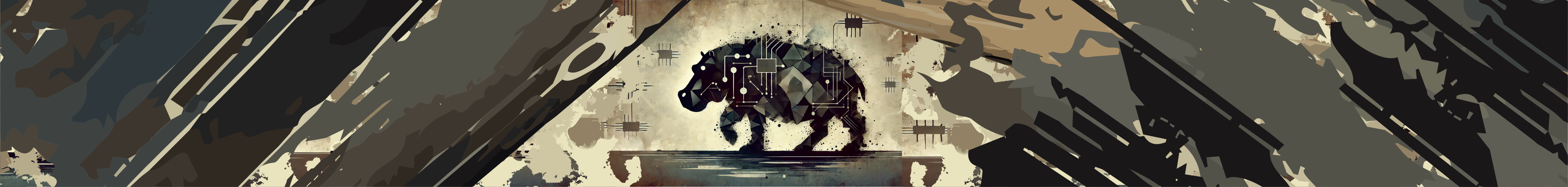
The final concept became the prehistoric-inspired beast. Its head echoes a hippopotamus — fierce, wide-mouthed, full of tension. But the body is pure Moschops: bulky, grounded, and ready to charge. The creature faces directly forward, its jaw unhinged in a primal snarl. Its muscles are defined and coiled, as if caught in the moment just before impact.
I wanted its posture to feel powerful, almost confrontational—a perfect metaphor for what the pedal does when set to full intensity. This isn’t a background shimmer. It’s a rhythmic force with attitude.
Wrapped in Modulation
Around the creature winds a glowing sine wave, broken and segmented to mimic the chop of tremolo. It wraps around the form like a current of energy—vibrating, tense, alive. This wave is more than just an aesthetic element; it’s a visual cue of the pedal’s motion and pulse.
The wave glows against the creature’s form, casting highlights and rhythmically slicing through its silhouette. It makes the illustration feel charged, as if sound itself is radiating from the artwork.
Color, Atmosphere, and Attitude
The background is a gradient lavender, lightest at the center and fading to deeper violet tones toward the edges. This creates a dramatic spotlight effect, pushing the creature forward and drawing your eye to its snarling face.
Lavender might not be the expected choice for a pedal this intense, but that’s exactly why it works. It brings contrast—a balance of softness and danger, control and chaos. Like the pedal itself, the colors combine the unexpected in a way that just feels right.
A Visual Pulse
Everything about this design aims to reflect the feel of the Moschops tremolo: bold, dynamic, rich with energy. The creature represents rhythm given form. The sine wave is the chop. The color, the swell.
Together, they create a visual identity that matches the sound experience. This isn’t just an effect—it’s an expressive tool with muscle, motion, and voice.
Stay tuned for more RhPf Electronics Behind the Scenes!
Want to read more like Moschops – The Graphic Design? Visit our full Behind the Scenes series on our subreddit.