A Perfect Name
Sometimes the pieces fall into place long after you think you’re done. Before we ever settled on its name, the Mo(s)ghoul pedal was already built, tested, and snarling beautifully. The name came later—Mo(s)ghoul—a mix of “MOSFET,” “mogul,” and “ghoul.” At first, it was just a fun contrast that sounded right for a distortion pedal with range and attitude.
But it wasn’t until much later—when we started experimenting at lower gain settings and rolling off the guitar’s volume knob—that the pedal revealed another side of itself: smooth, articulate, unexpectedly refined. The kind of response you’d expect from something a lot more polite. That’s when we realized: this name didn’t just sound good. It fit. Mogul for the class. Ghoul for the chaos.

The Concept: A Ghoul in a Mogul’s Suit
Subsequently, that duality became the design brief. Simone pitched a character: a 1950s Hollywood mogul, mid-transformation into a decaying, hollow-eyed ghoul. Not a metaphor. A literal split being. One side polished and powerful in a crisp vintage suit. The other, feral—skin peeling, features sunken, eyes empty.
Surely, Simone took the idea and ran with it.
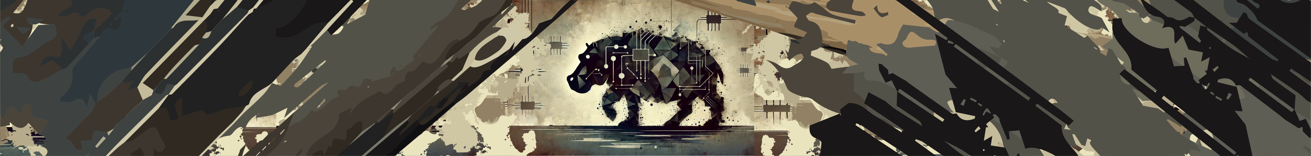
Overall, the final image is an illustration of a character, divided cleanly down the center. Behind him stretches a desert landscape that fades into ghostly mist and abstract, post-apocalyptic forms. The figure is positioned low, at the very base of the enclosure, to exaggerate the towering, unsettling background. It’s a visual metaphor for the pedal’s own sonic reach—from grounded control to something much bigger, stranger, and darker.
The Aesthetic: Fallout Meets Mid-Century Drama
We asked for a touch of Fallout—cartoonish, darkly playful, steeped in post-war nostalgia and decay. The result combines vintage confidence with radioactive ruin, as if a studio executive walked straight into the end of the world. It’s bold, weird, and unsettling in the best way—just like the Mo(s)ghoul’s voice.
A Design That Found Itself
This one wasn’t mapped out in advance. The name came after the sound. The visual came after the name. Each step fed the next until the identity of the Mo(s)ghoul was fully formed—one half suave, one half shredded.
Like the pedal itself, the design didn’t shout what it was right away. You had to listen closely. Roll back the gain. Turn down the volume. Let it speak.
And once it did, everything made sense.
Stay tuned for more RhPf Electronics Behind the Scenes!
Want to read more like the Mo(s)ghoul The Graphic Design? go to our Behind the Scenes series on our subreddit.